
Welcome to Overdue Books, my bi-weekly column on graphic novels and other sequential art collections I found in the library (thereby freeing me from the burden of actually buying the things first).
This week's installment of Overdue Books is brought to you by the letter D. Unfortunately, due both to time constraints and the lack of material starting with the letter D at my local library (some Daredevil fan in my neighborhood must have a lot more free time than I do), this week's column is a bit shorter than most, featuring two reviews rather than three. D is for Dingbats, Dag-nabbit, Ding-Dong, and Dirk Deppey.
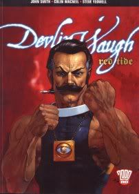 Devlin Waugh: Red Tide
Script by John Smith, Art by Steve Yeowell and Colin MacNeil
Published by 2000 AD; $19.95 US
Devlin Waugh, former strongarm of the Vatican turned reclusive vampire and media whore, comes out of retirement when a powerful beast from Devlin's past is freed from its magical prison. Later, he leads a group of survivors on a futuristic island resort against an army of aquatic vampires.
Considering the somewhat ridiculous origin of the character and his aristocratic demeanor, you initially expect Red Tide to be something of a British pulp parody with the kind of sci-fi/magic feel you'd get in Top Ten. Unfortunately, the humor of the story is drowned out by a confusing plot. Smith constantly attempts to impress the reader with his invention of complicated phrases representing the mix of magic and science in Red Tide's setting. Lines of dialogue like the following are spoken every few panels in the first half of the trade: "We're using Red Sect ritual in conjunction with DreamShaper Voodotronics. A Delta-T satellite array broadcasts the signal." Smith overloads the early chapters with these clumsy, undefined terms. At first you're curious about what it all means, and finally--after the list of the voodootronic-like phrases grows longer and longer without any attempt to educate you as to what they're supposed to mean--your curiosity dies right along with your interest in the story.
Eventually a large group of heroes surrounds the main character, making the story feel like a more confusing B.P.R.D., and one of the more interesting aspects of the tale is how little the main character has to do with how the events unfold. Not in a "Beta Ray Bill takes center stage in Thor" kind of way but more like a "why did they even bother putting him in the comic" kind of way.
The second half of the trade is much more straightforward and a hell of a lot bloodier. Unfortunately, while Colin MacNeil's more articulate style serves the purposes of the story much more than the flatness of Steve Yeowell's art did in the previous half, the colors are horrendous. Usually one color dominates every few pages, and far too often that color is black. It doesn't make the second half as confusing as the first, but it comes close. For example, every now and then you'll notice that the number of survivors under Devlin's care have inexplicably shrunk. Usually, this is because a page or two beforehand, more characters were slaughtered by the vampire mob, but the colors were so dark you couldn't make it out.
Originally serialized in 2000 AD and Judge Dredd Megazine, the one mark in the plus column is that the different pieces of the story come together more seamlessly than some other trades collecting stories that originally appeared in 6 or 7 page installments. Still, I can't find any reasons to recommend it.
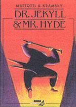 Dr. Jekyll & Mr. Hyde
Adapted from the work of Robert Louis Stevenson
Script by Lorenzo Mattotti and Jerry Kramsky, Art by Lorenzo Mattotti
Published by NBM; $15.95 US
This oversized hardcover adaptation of Robert Louis Stevenson's novel The Strange Case of Dr. Jekyll and Mr. Hyde transplants the tale from the end of the 19th century to the 1920s. It's an interesting switch, considering how much the original story was a product of the simultaneous sexual repression and obsession that characterized the Victorian era, versus the relative sexual freedom of the Roaring Twenties.
Rather than juxtaposing the sexual identities of rival eras, the change seems to be made to suit the art. Mattotti draws the story in a Cubist style--Cubism was an art movement that began to rise in prominence in the early 1900s--with vibrant colors that have the effect of perpetual sunset, punctuating the half-dark place the main character has created for himself. His renderings of Mr. Hyde are perhaps the most chilling ever in sequential art form. The squat, grey half-man appears sometimes as a more warped version of The Penguin, sometimes as a demonic shark.
The narration and script are both eloquent and sparse enough to not detract attention from the art. Storywise, this version of Dr. Jekyll & Mr. Hyde doesn't bring any new insight to the characters, but it's one of the few examples where the art itself managed to impress me regardless of the script.